From clutter to clarity: a complete platform overhaul for seamless API integration.

From clutter to clarity: a complete platform overhaul for seamless API integration.

From clutter to clarity: a complete platform overhaul for seamless API integration.

Q2, 2023 | Platform redesign

This case study is based on a real-life project; due to confidentiality, logos and exact designs are omitted, but the content reflects the process closely.

Safendty is a digital communications platform enhancing customer engagement and security

Business needs

1

Grow self-service accounts by 10%

Grow self-service accounts by 10%

2

Standardize user experience across platforms

Standardize user experience across platforms

3

Simplify user experience

Simplify user experience

Timeline

Project duration

From Q2 2023 - Q4 2023

My role in the project

My role in the project - Lead UX Designer

Lead UX UI designer - I drove all design efforts, conducted research and testing, and worked with stakeholders to deliver the most feasible/efficient solution.

I drove all design efforts, conducted research and testing, and worked with stakeholders to deliver the most feasible/efficient solution.

The outcome

The [realistic] design process

The [realistic] design process

Understanding the problem through research

Platform audit + user testing

Customer-facing stakeholder interviews

Analyzing data and presenting results

Ideating solutions

Navigation optimization

Homepage revamp

Product pages revamp

Testing our solutions

A/B testing our approaches

Analyzing the data

Updating designs

Hand off

Design hand off

Ongoing development support

Metric check-ins

Ongoing metric reviews

Understanding the problem

Safendty struggled to provide a seamless experience for users (primarily developers) to explore and test our APIs before committing as paid customers

Safendty struggled to provide a seamless experience for users (primarily developers) to explore and test our APIs before committing as paid customers

Before the redesign

Before the redesign

Users had to navigate through different platforms to perform different tasks.

The trial experience was inefficient, making it difficult for users to effectively learn about and test the products.

Navigation was poorly optimized, resulting in cluttered main pages filled with excessive links.

Key product information and use cases were lacking, leaving users without the context needed to make informed decisions.

Research - test

I led "friends and family" usability tests with newcomers, including new technical hires, to identify usability gaps of our existing platform

I led "friends and family" usability tests with newcomers, including new technical hires, to identify usability gaps of our existing platform

Findings:

Findings:

1

Both technical and non-technical users found the testing process overly complex and expected clearer guidance.

2

The card layout hindered access to key details, reducing user engagement with the content.

3

We identified inconsistencies in information across platforms, which led to user confusion.

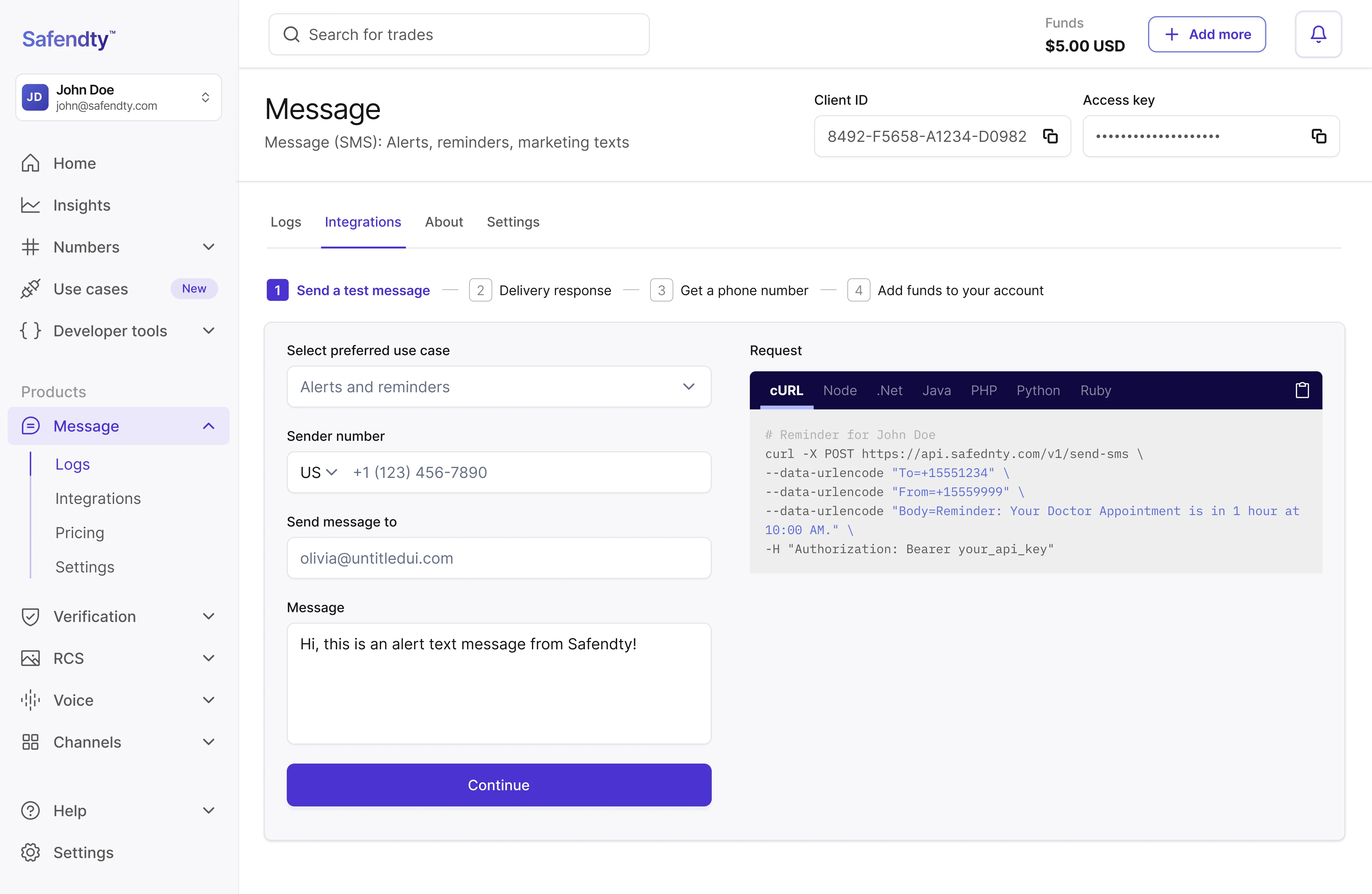
Research - interviews

In parallel, I interviewed customer-facing stakeholders to gather insights on top concerns and frequently asked questions or requests

In parallel, I interviewed customer-facing stakeholders to gather insights on top concerns and frequently asked questions or requests

Insights

  • Users frequently open support tickets requesting pricing information, as it's not easily accessible in the portal or on the website.

  • Customers have expressed frustration with switching between platforms, with some openly considering competitors as an alternative.

  • Paying customers rely heavily on reports and need easy access to review them.

  • There’s an opportunity to create FAQ content that answers common questions and simplifies the user experience.

Based on all the findings, we arrived at two design layouts and information architecture

Based on all the findings, we arrived at two design layouts and information architecture

We A/B tested the two options and found the following:

We A/B tested the two options and found the following:

We A/B tested the two options and found the following:

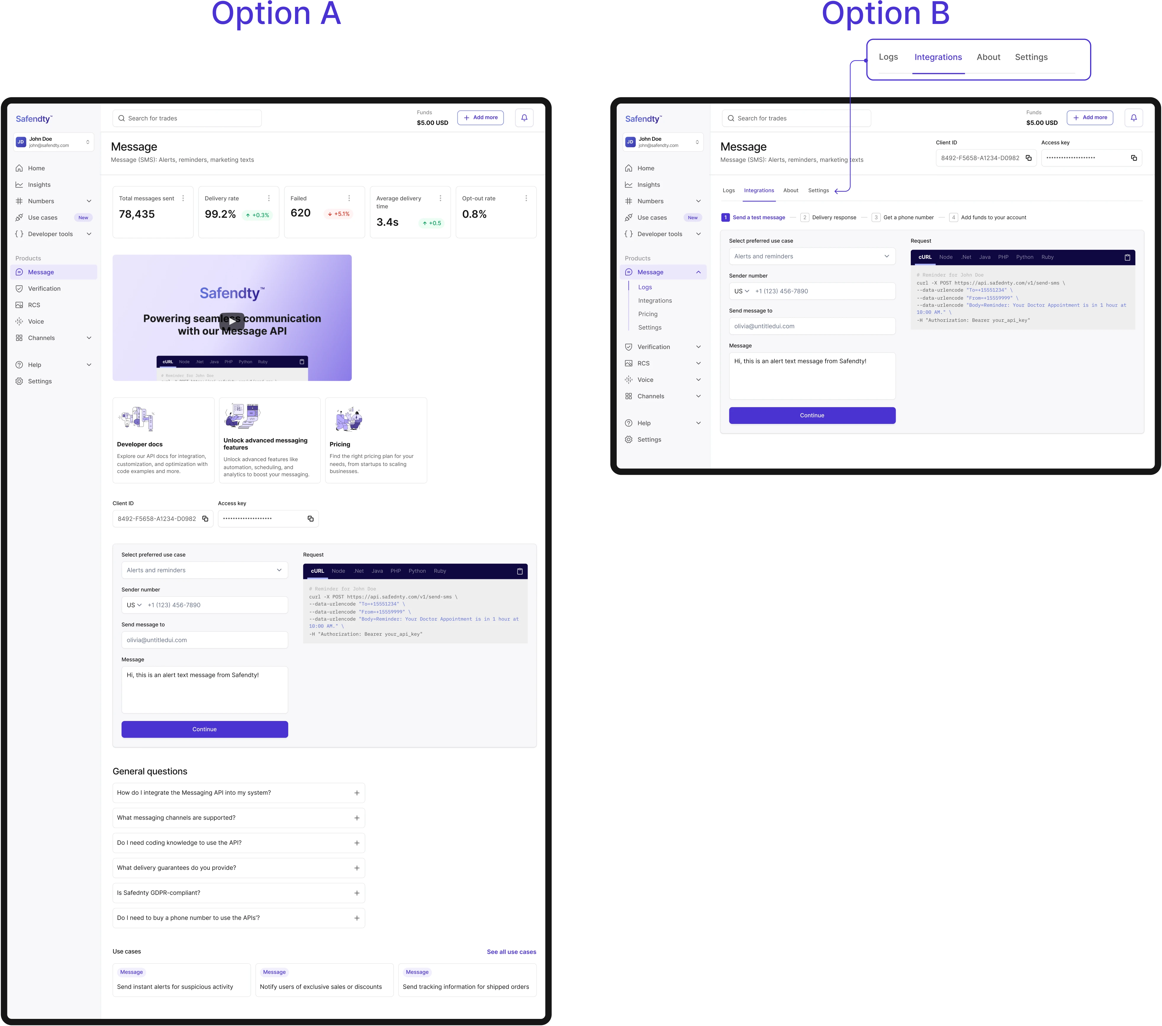
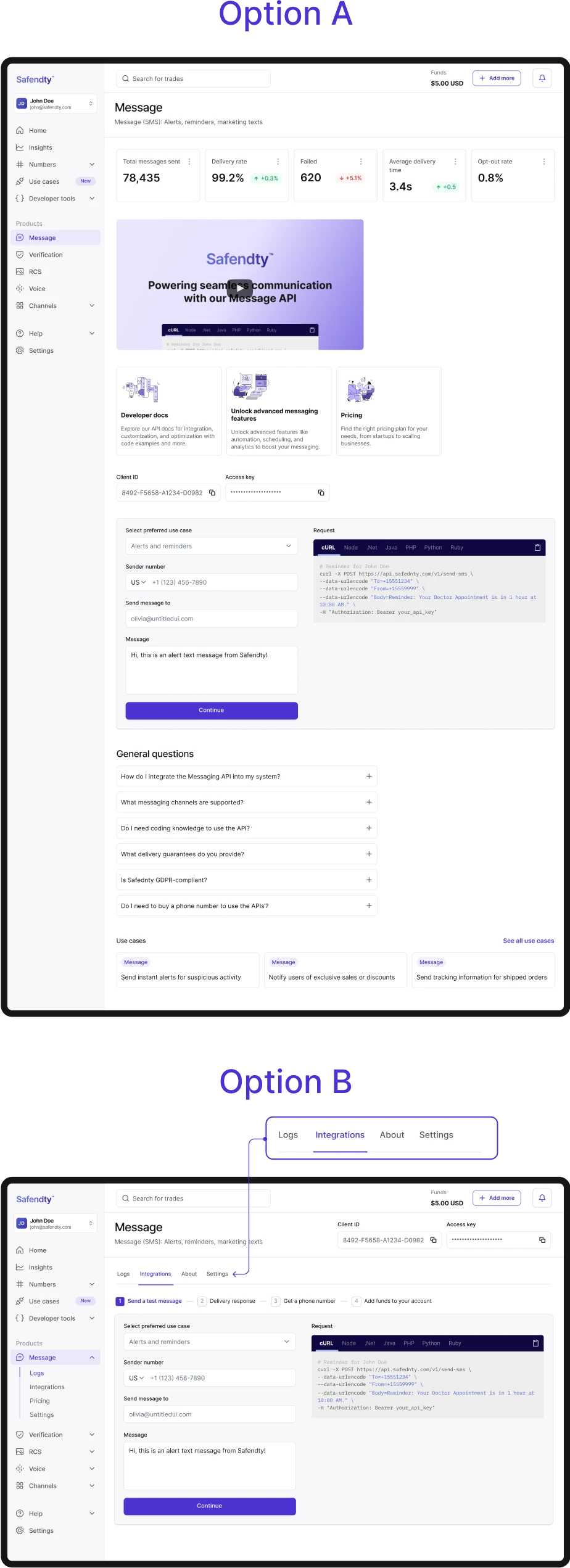
Option A: Users appreciated the guided content but took more time to complete the assigned tasks.

Option B: Users performed better with this option, interacting with the tab right away and reaching the desired pages more quickly.

We also learned:

1

The interactive format was most effective in showcasing how our products work.

2

Users completed their tasks more efficiently with a clear "1-2-3" guided experience.

3

Most users accessed the "About" section of each product through the use case, indicating that use cases were clearer than product names, especially when the products had similar names.

The redesign

A breakdown

Redesign breakdown

Optimized navigation

A sidebar prioritized key actions, such as testing tools, reports, and product settings, with collapsible menus for seamless exploration.

Sidebar

Numbers

Use cases

Developer tools

Products

Logs

Help

Settings

Contact support

Troubleshooting guides

FAQ

Register a testing number

Home

Verification

Integrations

Get a phone number

Pricing

Settings

SDK Libraries

API reference

Insights

Engagement

Onbording

Improved Navigation

A sidebar prioritized key actions, such as testing tools, reports, and product settings, with collapsible menus for seamless exploration.

Improved Navigation:

A sidebar prioritized key actions, such as testing tools, reports, and product settings, with collapsible menus for seamless exploration.

Action -oriented homepage

Transformed the cluttered homepage into a clear, user-focused page with easy access to products, use cases, and essential information for each role type.

Action -oriented homepage

Transformed the cluttered homepage into a clear, user-focused page with easy access to products, use cases, and essential information for each role type.

Focussed product experience

Added visually engaging content explaining each product, use cases, and FAQs for quick understanding.

Focussed product experience

Added visually engaging content explaining each product, use cases, and FAQs for quick understanding.

Tutorial content

Developed step-by-step guides for testing APIs, tailored for both technical and non-technical users, including tailored snippets of code for the available use cases for each product and programming language.

Tutorial based content

Developed step-by-step guides for testing APIs, tailored for both technical and non-technical users, including tailored code snippets for the available use cases for each product and programming language.

Impact and learnings

Impact and learnings

Achieved a 30% increase in task success rates and reduced bounce rates by 24%, enhancing user engagement and overall product performance.

Achieved a 30% increase in task success rates and reduced bounce rates by 24%, enhancing user engagement and overall product performance.

Before redesign

Before redesign

  • Users struggled with a complex testing process and lack of clear guidance.

  • Navigation was cluttered with excessive links, leading to confusion.

  • Key product information and use cases were unclear, hindering decision-making.

  • Customers had difficulty accessing support information like pricing and reports.

After redesign

After redesign

  • Simplified navigation with a sidebar for easy access to key actions (testing tools, reports, settings).

  • Transformed homepage into a clear, user-focused page with easy access to relevant content.

  • Added engaging product content, including use cases and FAQs, to provide clearer context.

  • Developed step-by-step guides with tailored code snippets to assist both technical and non-technical users.

Learnings

No resources don’t always mean no research, somehow

  • Don’t underestimate the power of research—minimal/internal research is better than nothing.

  • Dive deep into discovering what the problem really is before introducing immediate surface-level solutions based on visual preferences.

  • Be open to other ideas—we developed a first design iteration that worked well but still needed a boost, and through testing, we discovered potential improvements in the content structure that led to a better product before starting development work.

  • This project reinforced my love for solving complex challenges and adapting design solutions to fit business realities.

  • No resources don’t always mean no research, somehow.

  • Don’t underestimate the power of research—minimal/internal research is better than nothing.

  • Dive deep into discovering what the problem really is before introducing immediate surface-level solutions based on visual preferences.

  • Be open to other ideas—we developed a first design iteration that worked well but still needed a boost, and through testing, we discovered potential improvements in the content structure that led to a better product before starting development work.

  • This project reinforced my love for solving complex challenges and adapting design solutions to fit business realities.

Other cases studies

Safendty

Safendty

How I built a design system and led a team from scratch (with no prior experience)

Read the full story

Ola

Ola

Bringing people closer through real-life language experiences

Read the full story

Let's create something meaningful

Let's create something meaningful

Whether you’re looking to revamp an experience or craft something from scratch, I’m here to collaborate and bring your vision to life.